
Responsive Menu 4.3.0
Responsive menus are intelligent menu systems that can adapt themselves according to the environment they are run on. Most menu systems available for joomla fail miserably on mobile platforms. This is a real problem especially when you have drop-down menus. They work on mouse hover, when tablets and mobiles dont even have a mouse cursor. No mouse hover means non-working menu on such environments. For you it could mean losing a large number of customers.
| Views | 6,231 | Downloads | 6 |
|---|---|---|---|
| Version | 4.3.0 | Created | 2016-05-08 |
| System | Joomla 1.5 & 2.5 & 3 | Changed | 2024-02-27 |
| Developer | Cecil Gupta | ||
| License | GNU/GPL  |
Price | 35 $ EUR |
Here comes our menu system to help you fix this situation.
Responsive Menu for Joomla
Do you have a joomla site, but are having navigational issues on mobiles? Does your menu not work pretty (or at all) on iPads, Tablets?
Responsive Menu can help you solve this problem. Now you can use Joomla with drop down Menus on Mobiles and tablets
Browser Support
- Mozilla Firefox
- Google Chrome
- Safari
- Opera and Opera Mobile
- Internet Explorer 8 and 9
- Android 2.3 Stock Browser
Intelligent platform detection
Responsive menu adapts wisely depending on the platform it is used on. It works on Desktops, tablets, and any of your chosen smartphones (with javascript support). Ofcourse this may not help on non-javascript browsers, but thats not web for anyway.
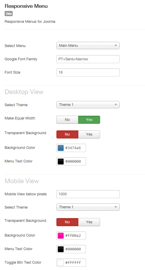
Super-Easy backend customisation
You dont have to be a programmer to customise the look of the menu to suit your webpage. It provides easy setup of colors right from the backend. Even if you are a programmer, the code is nice and easy to maintain.
Optimised javascript built with jQuery
most preferred javascript library, and we use CDN locations which are cached on most devices.
Comments