
Mediabox CK Pro 2.8.1
Open any media (images, videos...) in a responsive popup compatible with touch devices . You can show any media (images, vidéos, flash, audio, html content, etc...). Multiple options to drive styles and effects : width, color, margin for slide effect, duration, transition, etc...

It has been designed with the jQuery version included into Joomla! and uses a minified version of the script to reduce the page load and keep your website fast loading.
TOUCH features : you can zoom and move the image like a Mobile Photo App !
Features
- Can show any media : images, videos, html
- Responsive behavior : resize the media according the screen size
- Responsive layout : full screen image and bigger buttons to use with your finger
- Designed to work with touch device : swipe to navigate, tap to zoom on the image, use the finder to pan the zoomed image
- Mobile detection based on resolution or device type
- Group your medias into albums to navigate through them
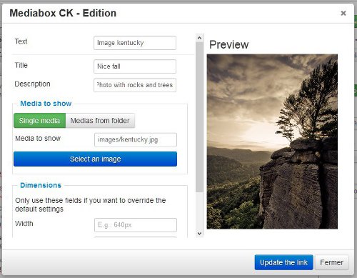
- Easy integration with the editor button (Pro version)
- Autoload images from a folder (Pro version)
- Tags to be used anywhere in your website to create a link (Pro version)
- Can replace any existing Lightbox : you can select which selector to use for your links
- Image gallery that loads images automatically from a folder (Pro version)
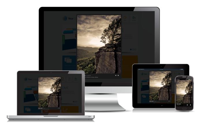
Mediabox CK has beed designed to be a responsive Lightbox with support on Touch devices.
Edit the plugin options to set the way the plugin will detect the responsive mode :
- Detection based on resolution : give the resolution in px under which the Lightbox will turn into the mobile layout
- Detection based on the device type : mobile and tablet, or mobile only
You can also choose to deactivate the mobile behavior if you don't want to use it.
Responsive layout designed for mobile
When the Mediabox detects that it must behave for mobile, it changes the layout to have the image in full screen with big buttons at the bottom. The buttons are big enough so that you can click on them with your finger.
Touch behavior to be used on mobile or tablet
When you are using the Mediabox CK on a touch device, you can use your finger to control and navigate.
- Swipe left of right to navigate into an album
- Pinch the image to zoom it and unzoom
- Once zoomed, use your finger to move the image to see the details


Add comment