

Simple Responsive Menu Pro 1.03
Simple Responsive Menu Pro is an enhanced version of our popular free menu module, Simple Responsive Menu.
The differences are:
- The pro version can use text or an image as the mobile menu link.
- The mobile menu is custom HTML, fully stylable with CSS, instead of a simple select list.
- The pro version supports the "new window" menu options, which is not possible with the basic version.
| Views | 3,101 | Downloads | 7 |
|---|---|---|---|
| Version | 1.03 | Created | 2021-02-03 |
| System | Joomla 3 & 4 | Changed | 2021-02-04 |
| Website | JED  |
Developer |
Les Arbres Design |
| License | GNU/GPL |
Price | 20 £ EUR |
On a wide enough screen, this page has a vertical menu on the right hand side. Below 800 pixels wide it changes to a hamburger at the top left. Try it.
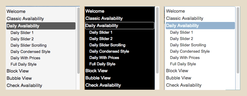
Clicking the hamburger opens a smaller version of the menu, styled by one of the supplied CSS files. You can configure the screen width where the switch takes place.
Simple Responsive Menu Pro comes with a choice of hamburger icons, or you can use your own, or use text.
It currently has a choice of three styles for the mobile menu, or you can make your own.
Only registered and logged in users can download this file.
Add comment